Logos
Freelance
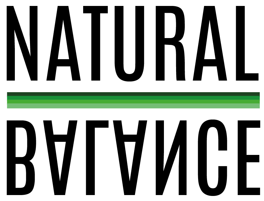
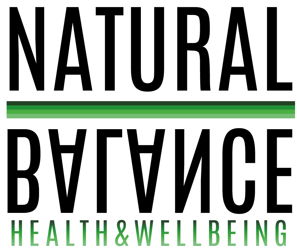
Natural Balance
I was asked to design a logo for Natural Balance. The company deals with nutritional therapy and lifestyle coaching. They didn't ask for anything specific, but they talked about what they hope to do with the company. I tried to stay away from generic images of scales etc., and after some initial ideas of cirlces and ying-yang type symbols, my client liked the the mirror image text based logo, as it was simple, still had the connotations of balance with the type and I used green colours which link to health. I created the second logo with the added 'health & wellbeing' for letter heads and business cards.
HD GLASS LTD
The client needed a logo designing for their new company. I was given some examples that the client liked and was asked to incorporate a window design into the logo. I decided to go with the illusion of a window with the text looking like it is ‘coming out’ of the window and I chose a simple thin font that would work well with the image.

Vitale Health
I was asked to design a logo for another nutritional therapy company, 'Vitale Health.' This time I was given more details to work with: what vitale meant (of life, vital), specific colours, what they hope to achieve with the company and their target audience. I was also shown some logos that they had seen and liked and they wanted leaves/trees to be incorporated into the logo somehow. After creating some logos with the leaf shape, I decided to create the 'man' in a lively pose, to incorporate the meaning of vitale. I was also asked to use a calligraphy typeface and decided to use grey rather than black because I think it works better with the green colours.

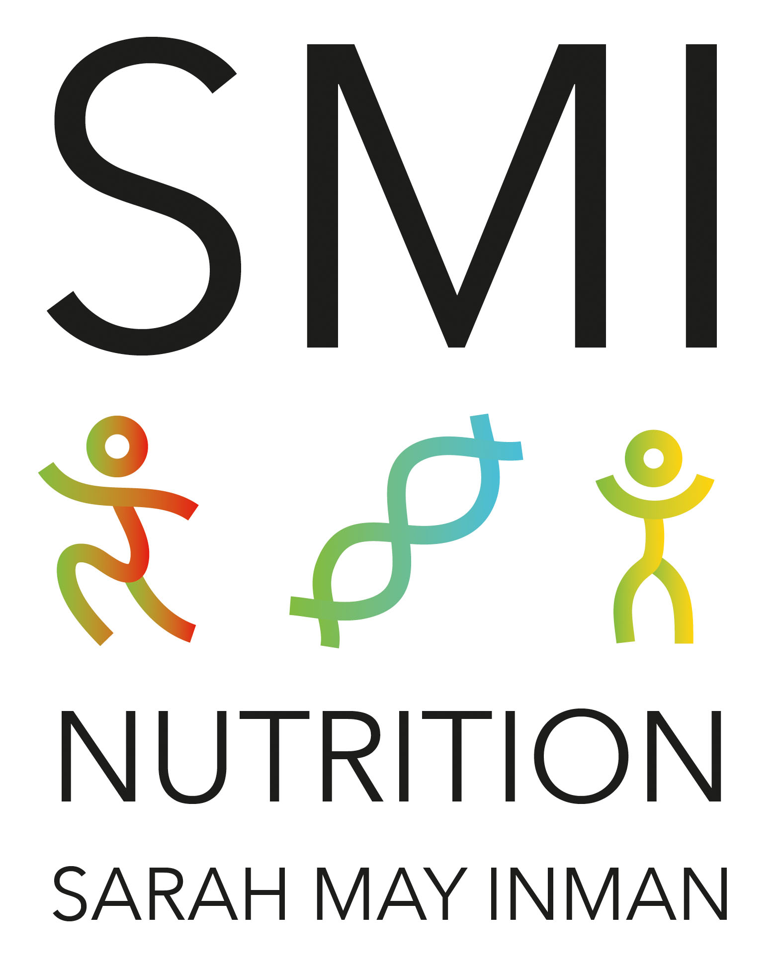
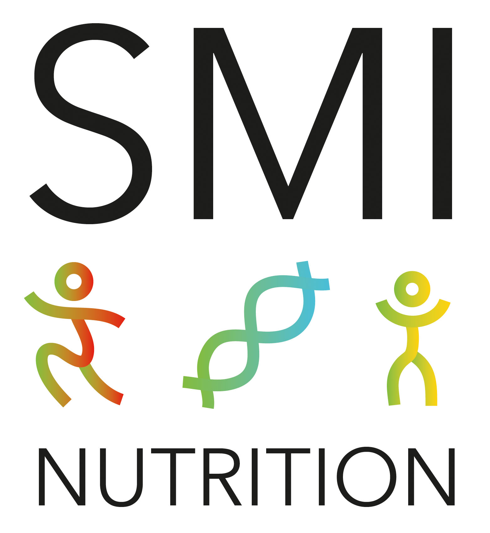
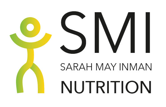
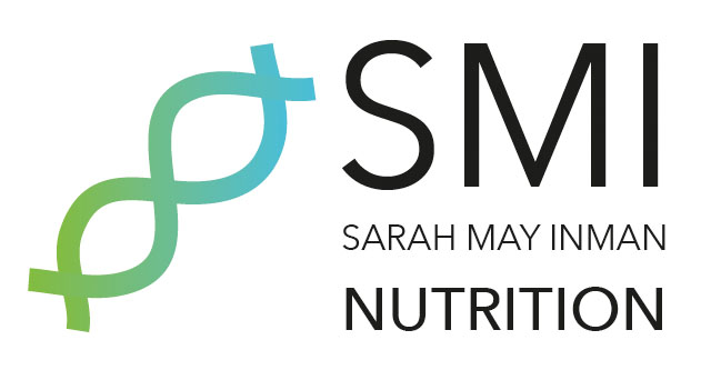
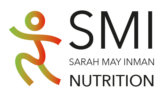
Smi nutrition
SMI Nutrition wanted to focus on the 3 areas of her company: Athletics, Genetics and Children. I created 3 little icons that she could also incorporate into her website for separate pages. I also used the 3 primary colours to separate the three aspects of her company.
Viva Natural
Viva Natural had referenced Natural Balance as a starting point for inspiration for their own logo, as they liked the simplicity and boldness of this logo. She also wanted the logo to reflect her brand, as she has a modern, simple look that is also used throughout her website. The client also expressed that she wanted alternate colours as well as the usual green, to stand out from her competitors.

Rebekah Grayson Design ©